
When you pick up a book that you might want to read, the first thing you see is the cover. It would be hard to overstate it’s importance.
On the Mary Tyler Moore show, decades ago, Mary asked an author in an interview, “When did you know your book would become a bestseller?” He replied, “When I saw that they had put a naked woman on the cover.”
Yeah, it’s like that.
When I was in college in the sixties, I would stop at the State News just about every day to see what was new. I would pick up any book whose cover caught my eye and read the first page. Most of the time, that was enough. It went back on the rack.
Bookstores are disappearing, and we are all on-line now. A few years ago, if a cover caught my eye, I would go to Amazon, check out the read me function and read the first page. Usually that would lead to the same result, no sale. Lately, the name has changed to read sample and it seems to be missing for a lot of the books I want to know more about. I end up chasing reviews.
Covers have become increasingly important in e-life, since they are frequently the only thing the would-be reader gets.
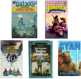
By now you must be wondering about the covers at the top of this post. They represent my five published works, in chronological order. Which one is not like the others?
You might say top left. True, because it is of different proportions, wider for its height. That is because it is a digest size magazine, not a novel.
Second choice? I hope you said bottom right because that cover represents the shift to on-line sales.
At a newsstand, or in a bookstore, or in a dump in a grocery store, (a dump is a temporary cardboard bookshelf provided by the publisher) you only see the cover when it is on the book. It is always full size.
On-line we see thumbnails of covers. The beautiful artwork that used to adorn them, and still does in many cases, requires a microscope to admire. The title and author, however, have to be readable at any scale.
Cyan is primarily an e-book, with POD (print on demand) available for those who don’t want to read on screen. It is not self-published; EDGE of Canada published it. They provided appropriate cover art and made the title and author’s name quite large.
Since I am now in the process of starting self-publication, I have become even more focused on covers. E-book covers are now mostly words. There is usually still cover art and often it is excellent. Once it springs to size on your desktop computer or tablet, you can appreciate it. Not so much on a small screen e-reader, and on your smart phone the cover is pretty much still a thumbnail.
I have seen hundreds of e-covers while doing research. Many put everything in its proper proportion. Many others are basically just title and author’s name, with minimal artwork. Others look like they were produced for the newsstand with nice art, but the title and author’s name are far to small to be effective in a thumbnail.
Nevertheless, the artwork is usually still there, and it can still boost sales if it is eye-catching. It can still kill sales if it is ugly, or inappropriate for the text inside. It’s just harder to deal with now that it is tiny while in it’s native environment, your smart phone.
More on this next time.
