Tag Archives: self publishing

731. Cover Art, . . . the Bad and the Ugly

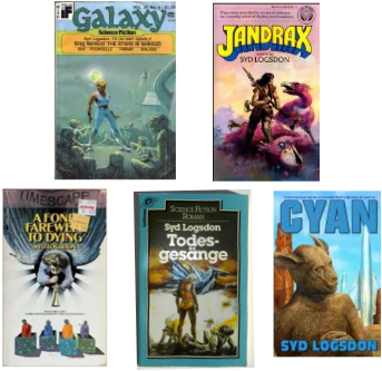
Again, the five covers at the top of this post represent my five published works, in chronological order. Let’s continue from the bottom left.

It is hard to tell from these thumbnails, but the quality of the “angel” is excellent.  The four “zombies in electronic boxes” are not so easy on the eyes, but I presume that was a deliberate choice by the artist, Kevin Eugene Johnson. I don’t criticize Johnson’s skill as an artist, and I don’t know who chose to use a symbolic representation of the novel, but the result was a killer.

A Fond Farewell to Dying was my second published novel. I was in a good place. After Jandrax sold, I was advised to get an agent and I found Virginia Kidd. You probably haven’t heard of her. Fame is fleeting for agents, but she was top of the line for the eighties. She pitched FFTD to David Hartman and he bought it.

Hartman was at Pocket Books and he was about to launch a new line called Timescape. FFTD was among the first group of books released, but when I saw the cover, my heart sank.

At the top is a banner proclaiming the new imprint. That was a good idea, since everyone was waiting for Timescape to arrive. But the image — it had nothing to do with the story. That’s not unusual, but in this case, it was almost certain to scare off anyone who would have enjoyed the actual story within.

This is about cover art, not blurbs, but I have to tell you what those tiny words just under the trumpet say, because they are a key to the thinking of whoever designed this mess:

WHAT PRICE LIFE?

SURRENDER YOUR BODY! GIVE UP YOUR SOUL!

Nope. Not even close to what the novel contained.

FFTD was a straight science fiction novel about artificial immortality through cloning and memory taping. One of my intentions was to treat the matter accurately. There was no end of cloning stories around in the early eighties, but most of them were, scientifically, pure BS. I wanted to do it better.

There were no zombies. There were no electronic boxes. There was no angel, particularly not an angel with a trumpet sounding out the Last Days.

I did use the interplay between Dave, a lapsed fundamentalist Christian, and Shashi, his lover who was Hindu and a  believer in reincarnation. Their arguments allowed me a deep look into the morality of artificial immortality, but it had nothing to do with zombies and angels of the last trump.

In the weeks after publication, I found a copy of FFTD in a local grocery store, in a dump full of religious books. Based on the cover, somebody had placed it beside The Bible Story Books and The Jesus Generation.

A Fond Farewell to Dying never found its audience. Big surprise.

Things get tangled in the world of publishing. In researching this post, I found out that the same image was used as the cover of Gute Nachrichten aus dem Vatikan und andere »Nebula«-Preis-Stories, which is the name under which the German translation of Nebula Award Stories Seven appeared.

Cover images are frequently recycled. Johnson’s image was a virtual parody of FFTD, but it had nothing at all to do with the Nebula winners. Oh, well. That’s business in the publishing industry.

More irony — FFTD itself sold to Goldman Verlag, another German publisher, in 1984. They changed the title to Todesgesange (Death Song) and chose a cover that looks like tormented creatures in a Hellscape. Take a look at the middle image in the bottom row.

Is that creature in the middle supposed to be a demonic angel?  I never could tell.

Arrrrrrr! You can translate that into your favorite cuss words. I don’t like to use profanity in A Writing Life.

A lot of things changed between FFTD and Cyan, the last thumbnail above. I had a lot of input into the details of publication, including an early look at the cover. I wasn’t always listened to, but that is to be expected. I was pleased with the artwork.

The creature on the cover looks a little too much like an actor in a skin suit, but it is actually a key creature from the story, a para-Cyl. The original Cyl were bipedal, tailless hoppers, sub-human but of relatively high intelligence. Because of (DELETED), one of the crew felt obligated to (DELETED) by means of recombinant DNA. Then she (DELETED) which caused no end of problems.

Cyan is still available from Amazon. When you read it, you will thank me for the deletions.

And when you visualize the Cyl, fold their legs, make their upper bodies smaller, their butts bigger, and their ears longer. But don’t make them look like kangaroos. Cyl don’t have tails, and that changes their whole anatomy.
730. Cover Art, the Good . . .

The five covers at the top of this post represent my five published works, in chronological order. Let’s take a closer look.

The first cover is a magazine, Galaxy, gone now but once highly influential. It was my first publication and I had the good fortune not only to be placed in Galaxy, but to be the cover story.

Just under the magazine title you will see a yellow-orange rectangle which can’t be read because of data loss. It gives my name and the title of my novella, then lists “Greg Benford: The Stars in Shroud, plus Pournelle, Fabian, Walker:.

These five covers are in order of their publication, not their creation. After a first novel which was unsaleable, I wrote Jandrax. Then I wrote the beginnings of the Menhir novels —  about as many words as Jandrax, but only a fraction of what that project would eventually become. Then I wrote A Fond Farewell to Dying.

At that time I was still unpublished. Before FFTD was finished, I had recognized that a chunk out of the middle could be separately marketed as a novella. I extracted it, trimmed it to fit, and sent it to Galaxy, then finished FFTD. They bought the novella, changed the name to To Go Not Gently, and provided the cover art. All I had to do was sign my name to the contract.

I’ve told all this before, but today we are here to analyze cover art. The scene depicted is quite accurate to the story. That often doesn’t happen. The guy in the center is David Singer, aka Ram David Singh, an American biologist working in the post-nuke era when India is the only remaining country which wasn’t basically destroyed by the last war. He is on his way to an important meeting as he passes through the Avenue of Abominations, a street in Bombay where mutants gather.

It is a somewhat old fashioned style of cover art, completely appropriate to a magazine which had been around since the Golden Age of science fiction.

Jandrax came next. I received an acceptance after TGNG had been bought, but before it was published. The sale of TGNG had no influence.

The art, by Doug Bleekman, is superb. Again, I had nothing to do with it. I saw it first when the author’s copies of the book arrived by mail. The creatures are leers, and yes they should be giant birds, and yes they were supposed to be pink. They also had teeth. I knew that brown reads fierce and pink reads silly, but I chose to work against expectations. The fellow with the long hair, leather clothing, and antique rifle is also true to the novel. He is a second generation survivor of a lost and stranded starship.

My first review, a one-liner in Locus, just talked about fierce flamingos. I have to accept that. Covers are completely about snap judgements.

Notice how big the title is, and how yellow. Against the pink sky and above the pink birds, it really grabs the eye. Notice how tiny my name is. That, too, is appropriate. It was my first novel; nobody had heard of me; making my name bigger would not have sold any more books, and it would have detracted from the overall effect.

I loved that cover. I didn’t love the next one, but we can talk about that next week.

More next time.

729. Covers

When you pick up a book that you might want to read, the first thing you see is the cover. It would be hard to overstate it’s importance.

On the Mary Tyler Moore show, decades ago, Mary asked an author in an interview, “When did you know your book would become a bestseller?” He replied, “When I saw that they had put a naked woman on the cover.”

Yeah, it’s like that.

When I was in college in the sixties, I would stop at the State News just about every day to see what was new. I would pick up any book whose cover caught my eye and read the first page. Most of the time, that was enough. It went back on the rack.

Bookstores are disappearing, and we are all on-line now. A few years ago, if a cover caught my eye, I would go to Amazon, check out the read me function and read the first page. Usually that would lead to the same result, no sale. Lately, the name has changed to read sample and it seems to be missing for a lot of the books I want to know more about. I end up chasing reviews.

Covers have become increasingly important in e-life, since they are frequently the only thing the would-be reader gets.

By now you must be wondering about the covers at the top of this post. They represent my five published works, in chronological order. Which one is not like the others?

You might say top left. True, because it is of different proportions, wider for its height. That is because it is a digest size magazine, not a novel.

Second choice? I hope you said bottom right because that cover represents the shift to on-line sales.

At a newsstand, or in a bookstore, or in a dump in a grocery store, (a dump is a temporary cardboard bookshelf provided by the publisher) you only see the cover when it is on the book. It is always full size.

On-line we see thumbnails of covers. The beautiful artwork that used to adorn them, and still does in many cases, requires a microscope to admire. The title and author, however, have to be readable at any scale.

Cyan is primarily an e-book, with POD (print on demand) available for those who don’t want to read on screen. It is not self-published; EDGE of Canada published it. They provided appropriate cover art and made the title and author’s name quite large.

Since I am now in the process of starting self-publication, I have become even more focused on covers. E-book covers are now mostly words. There is usually still cover art and often it is excellent. Once it springs to size on your desktop computer or tablet, you can appreciate it. Not so much on a small screen e-reader, and on your smart phone the cover is pretty much still a thumbnail.

I have seen hundreds of e-covers while doing research. Many put everything in its proper proportion. Many others are basically just title and author’s name, with minimal artwork. Others look like they were produced for the newsstand with nice art, but the title and author’s name are far to small to be effective in a thumbnail.

Nevertheless, the artwork is usually still there, and it can still boost sales if it is eye-catching. It can still kill sales if it is ugly, or inappropriate for the text inside. It’s just harder to deal with now that it is tiny while in it’s native environment, your smart phone.

More on this next time.

727. The Arts of Self Publlishing


Here are some changes, if you are keeping track.

In November of last year, I explained that I had plans for self-publishing. Those plans are still firmly in place, but the schedule has changed — again.

The schedule for the five novels of the Menhir series were posted tentatively in November of last year. They were pushed forward in December. The first novel was planned to arrive this May, and that clearly isn’t going to happen. Now it seems that they are going to begin arriving about April of next year.

On the other hand, Learning from the Masters, originally scheduled for March of 2027, now looks likely to arrive this fall. The book scheduled for next February is still scheduled for the same month.

Well, I warned you. I said this in April —

My job should be to write books and leave the teases, the blurbs, and the come-ons to the publisher, but life never did give anyone what he wanted without some pain attached. Self-publishing is basically everything I never wanted.

I have been writing novels for fifty years, and I have gotten better over time. I’ve learned my trade, but self-publishing is different trade. Some skills translate. Most don’t.

I’m fortunate in one thing at least; I have also been painting all my life. Not frequently and not steadily, but enough to gain some skills. I can paint a duck that looks like a duck, but not like a duck painted by a real artist.

Fortunately I mis-spent by college days doing a lot of drawing; I was a Marvel comic artist wannabe. That will help. Also fortunately, I have been using vector graphics since 1986. I see my way forward as a mixture of drawing, painting, and captured photo images all turned in to a computer collage.

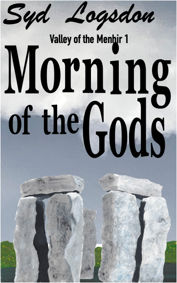
The roughout of Morning of the Gods above is what I’m talking about. There are two figures still to be placed in the foreground, mostly complete now but not perfected. He is painted, with added digital chain mail. She is digital and semi-translucent since she is invisible in the story. We’ll see.

I could just buy cover art. There is plenty of it around, but it not only has to look good, it also has to fit the story. It also doesn’t help that I am a perfectionist.

We’ll talk about cover art during the next few posts. For now, here are the specifics of scheduling.

The core Menhir series consists of five short novels — short by modern standards, that is. When I began writing, 40 to 50 thousand words was normal for a science fiction paperback. If it went much longer than that, it was hard to sell to a publisher for reasons revolving around the price of paper. I started Menhir in those days, and continued writing into the modern era when 100,000 words seems normal.

It never did see normal to me. I began in an era of brevity, and I still prefer it. The Menhir series has to be planned for a months long space of time. It needs four to eight weeks between books, but I could never keep up with a four week schedule because of the covers.

I have an unrelated book scheduled for next February. It really needs to be published at that time, so I am tentatively moving the Menhir novels into 2017. They should start in April and end in December, with eight weeks between each. I think I can manage that.

That leaves the rest of this year, but it’s no problem. All my books are finished, corrected, polished, and ready — except for covers. My present plan is to publish Learning from the Masters this September. I have that cover well in hand.

I hope.